musa508-final
NJT train delay prediction and web app
Background

The lifeblood of any large metropolitan city is in its transit, but it’s a dual-edged sword: not properly anticipating and handling train delays could be disastrous for the region economically and socially. For New Jersey, the densest state in the United States, having a statewide regional rail network is a particularly difficult affair. Developed over 190 years through multiple private railroad companies, the New Jersey Transit network today is still quite vulnerable to delays and outright cancellations, causing widespread frustration and disinterest among the public for transit. Especially as the pandemic has suggested the long-term viability of remote/hybrid work, people more than ever have the option to skip riding the train against their will, and transit agencies must must take the initiative through opportunities like the Building Back Better infrastructure bill to get the ridership they cannot now take for granted.

At the same time, there has been a movement among more transit agencies to expose more of their collected data to the public, whether pre-existing or newly captured. Analysts from inside and outside the agency can develop new rider metrics and analytics based on this historical performance, and eventually develop visualizations and dashboards both for their own purposes and as tools for savvy commuters.
In this report, our firm Limited Express was retained by NJ Transit to develop a proof-of-concept model, called NJT onTrack, that serves this dual purpose for the Rail Operations division. The eventual aim is to develop both a feature metric integrated in the existing NJ Transit app to predict and display potential delays before they occur, and build an analytical dashboard that displays historical train performance, service levels, and delay indicators. Using a linear regression model with temporal-spatial lag predictors, it is hoped that as delay predictions improve, they can eventually feed back into schedule planning and capital infrastructure investment to reduce delay hotspots altogether, both in time (time of day, day of week) and in space (particular bottlenecks or slow zones).
Setup
int.ampeak <- interval(as_hms("06:00:00"),as_hms("10:00:00"))
int.midday <- interval(as_hms("10:00:01"),as_hms("16:00:00"))
int.pmpeak <- interval(as_hms("16:00:01"),as_hms("19:00:00"))
int.evening <- interval(as_hms("19:00:01"),as_hms("23:59:59"))
int.overngt <- interval(as_hms("00:00:00"),as_hms("05:59:59"))
Kaggle data wrangling
Here we load and clean the initial delay data. Uploaded to Kaggle in 2020, it is a snapshot of the real-time departure times of nearly every NJ Transit train at each station from March 2018 to May 2020, compared to their scheduled departure time. For analysis purposes, it was decided to restrict the analysis timeframe to 2019 only, as data from 2018 was found to be relatively spotty, and 2020’s data factors were of course marred by the pandemic. In addition, because of continued rendering issues, the rail lines for analysis were limited to the Northeast Corridor and North Jersey Coast Line
We also load the GTFS data for verifying purposes, and to get geographic stop time data
njt <- read_gtfs("gtfs_njt.zip")
njt_sf <- gtfs_as_sf(njt)
Here we begin to wrangle the delay data into a single dataset. A number of tasks are done: - Agency was filtered for NJ transit, and all imcomplete stops removed, including trains noted as invalid - Each stop time associated with a time period through the day, from AM peak to overnight - A dummy variable for noting if the stop time was on the weekday or weekend - Assessing the route direction of the train associated the stop time; eastbound is towards New York Penn, Hoboken, or Atlantic City, and westbound the opposite direction - Defining the absolute ordinal stop sequence of each route so numbers are consistent even when express trains skip stations - A dummy variable for assessing if the train is over 6 minutes late at the stop time
njtlines <- rbindlist(delay %>% tidyselect:::select(starts_with('2019'))) %>%
  filter(type == 'NJ Transit') %>%
  filter(line %in% c('Northeast Corrdr','No Jersey Coast','Atl. City Line')) %>%
  arrange(date,line,train_id,stop_sequence) %>%
  filter(complete.cases(.)) %>%
  mutate(period = case_when(
    ymd_hms(paste0('1970-01-01',str_sub(scheduled_time,12))) %within% int.ampeak  ~ "AM peak",
    ymd_hms(paste0('1970-01-01',str_sub(scheduled_time,12))) %within% int.midday  ~ "Midday",
    ymd_hms(paste0('1970-01-01',str_sub(scheduled_time,12))) %within% int.pmpeak  ~ "PM peak",
    ymd_hms(paste0('1970-01-01',str_sub(scheduled_time,12))) %within% int.evening  ~ "Evening",
    ymd_hms(paste0('1970-01-01',str_sub(scheduled_time,12))) %within% int.overngt  ~ "Overnight"
  )) %>% mutate(isWkdy = ifelse(wday(date) %in% c(2,3,4,5,6),TRUE,FALSE)
   ) %>% mutate(direction = case_when(
    stop_sequence == 1 & from %ni% c('New York Penn Station','Hoboken','Atlantic City Rail Terminal') ~ 'eastbound',
    stop_sequence == 1 & from %in% c('New York Penn Station','Hoboken','Atlantic City Rail Terminal') ~ 'westbound'
  )) %>% fill(direction) %>%
  mutate(stop_seq_abs = as.numeric(factor(stop_sequence))) %>%
  mutate(isLate = if_else(delay_minutes >= 6,TRUE,FALSE))
We must also filter out faulty train runs that did not appear to record or change their timepoint when going from first to last station.
first <- njtlines %>% group_by(date,train_id) %>% arrange(stop_sequence) %>% filter(row_number()==1) %>% rename('first_time' = 'actual_time') %>% select(date,train_id,first_time)

last <- njtlines %>% group_by(date,train_id) %>% arrange(-stop_sequence) %>% filter(row_number()==1) %>% rename('last_time' = 'actual_time') %>% select(date,train_id,last_time)

invalid2 <- first %>% left_join(last,by=c('date','train_id')) %>% filter(first_time == last_time)

njtlines <- njtlines %>% anti_join(invalid2,by=c('date','train_id')) %>% filter(delay_minutes <= 240)
The last variable we can derive from existing data is the lagged delay experienced at each train’s previous station. This station-based lag is an approximation of the “spatial lag” found in other purely spatial-based analyses.
njtlines <- njtlines %>% group_by(date,train_id) %>% mutate(lagStation = dplyr::lag(delay_minutes,n=1,default=0))
Exploratory analysis and visualization
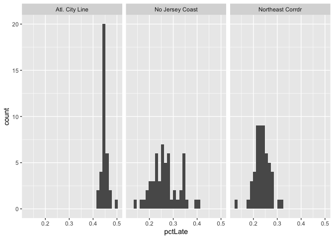
We begin by displaying a simple histogram of the percentage of trains that are categorized as late each week, by line. Most lines show close to a normal distribution, with the Atlantic City Line notably skewed towards being more consistently late. The Princeton Shuttle (or Dinky) is only two stops, and thus is not expected to be noticably late.
njtlines %>% group_by(line,week(date)) %>%
  summarise(pctLate = sum(isLate)/sum(isLate %in% c(TRUE,FALSE))) %>%
  ggplot(aes(pctLate)) + geom_histogram() + facet_wrap(vars(line))
Schedule deviance chart, faceted by time/direction of service
Here we separated the trains based on the period of the day, and draw diagrams show the average delay by station sequence through the entire journey of that period. Some signifiant time-space outliers in delays begin to appear, such as the Raritan Valley Line on westbound weekend overnights, which indicate that there is some underlying static pattern, such as maintenance or tight scheduling, that is causing consistent delays.
  p1 <- njtlines %>% filter(isWkdy & line != "Atl. City Line") %>% group_by(line,direction,period,stop_seq_abs) %>%
    summarise(avgdelay = mean(delay_minutes)) %>%
    ggplot(aes(x=stop_seq_abs, y=avgdelay, color=line)) +
    geom_line() +
    facet_grid(direction ~ factor(period,levels=c("AM peak","Midday","PM peak","Evening","Overnight"))) +
    ggtitle('Weekday') + labs(x="Station sequence",y="Average delay") + theme(legend.position='none')
  p2 <- njtlines %>% filter(!isWkdy & line != "Atl. City Line") %>% group_by(line,direction,period,stop_seq_abs) %>%
    summarise(avgdelay = mean(delay_minutes)) %>%
    ggplot(aes(x=stop_seq_abs, y=avgdelay, color=line)) +
    geom_line() +
    facet_grid(direction ~ factor(period,levels=c("AM peak","Midday","PM peak","Evening","Overnight"))) +
    ggtitle('Weekend') + labs(x="Station sequence",y="Average delay") + theme(legend.position='bottom')

  p1 / p2

Compared to the other lines, we can see that the Atlantic City line has considerably higher baseline levels of delays. This is because in 2019, much of the ACRL was on maintenance due to ongoing positive train control signalling installation; the data snapshot here may not be indicative of future trends.
  p1 <- njtlines %>% filter(isWkdy & line == "Atl. City Line") %>% group_by(direction,period,stop_seq_abs) %>%
    summarise(avgdelay = mean(delay_minutes)) %>%
    ggplot(aes(x=stop_seq_abs, y=avgdelay)) +
    geom_line() +
    facet_grid(direction ~ factor(period,levels=c("AM peak","Midday","PM peak","Evening","Overnight"))) +
    ggtitle('Weekday') + labs(x="Station sequence",y="Average delay") + theme(legend.position='none')
  p2 <- njtlines %>% filter(!isWkdy & line == "Atl. City Line") %>% group_by(direction,period,stop_seq_abs) %>%
    summarise(avgdelay = mean(delay_minutes)) %>%
    ggplot(aes(x=stop_seq_abs, y=avgdelay)) +
    geom_line() +
    facet_grid(direction ~ factor(period,levels=c("AM peak","Midday","PM peak","Evening","Overnight"))) +
    ggtitle('Weekend') + labs(x="Station sequence",y="Average delay") + theme(legend.position='bottom')

  p1 / p2

Stringline diagram of one day’s service
Here we introduce the Stringline diagram. Used by transit agencies throughout the world, it is a visualized tool for rail dispatchers to quickly view train schedule and operation on a certain line. The x-axis is time and y are the stations spaced by their actual distance. In this Northeast Corridor stringline on a random day, we can see that westbound trains are consistently more late than eastbound ones, a predictor that is of particular importance.
To accurately display the stringline we first get the milepost distance of each station, which is the approximate track-mileage distance of each station from a defined terminal like New York Penn Station. The inter-station milepost distance, or station spacing, was also recorded and included as a predictor.
milepost <- read_csv("milepost.csv")
njtlines <- njtlines %>%
  left_join(milepost %>% rename(to.dist.mp = dist_mp),by=c("to"="station")) %>%
  left_join(milepost %>% rename(from.dist.mp = dist_mp),by=c("from"="station")) %>%
  mutate(inter.dist.mp=abs(from.dist.mp-to.dist.mp))
oneday <- njtlines %>% ungroup() %>% filter(line == "Northeast Corrdr" & date %in% slice_sample(.)) %>%
  mutate(to.dist.mp=to.dist.mp*-1)

oneday %>%
  ggplot(aes(y=to.dist.mp,group=train_id,color=direction)) +
    geom_line(aes(x=scheduled_time),linetype='dashed',lwd=.50) +
    geom_line(aes(x=actual_time),lwd=.50) +
    scale_y_continuous(breaks = oneday$to.dist.mp, labels = oneday$to, minor_breaks = NULL) +
    scale_x_datetime(date_breaks = "1 hour", labels = date_format("%H:%M")) +
    labs(x='',y='Station (by milepost distance)',
         title="Northeast Corridor Line stringline diagram",
         subtitle=paste("on sample date",oneday$date,"| Dashed is scheduled time, solid is actual time")) +
    theme(legend.position='none') +
    facet_grid(rows=vars(direction))

Feature engineering
Weather
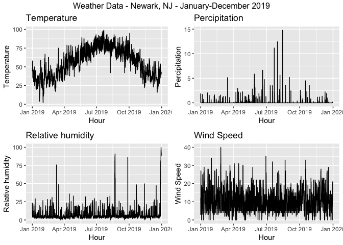
Weather has impacts on trains running significantly late. However, the weathers that has the most impact on rail operations is not precipitation, but wind speed, as the graph on the right one shows. The stronger wind is, there are more severe delays are observed.
weather.DataNWK <-
  riem_measures(station = "EWR", date_start = "2019-01-01", date_end = "2019-12-31")

weather.PanelNWK <-
  weather.DataNWK %>%
  mutate_if(is.character, list(~replace(as.character(.), is.na(.), "0"))) %>%
  replace(is.na(.), 0) %>%
  mutate(interval60 = ymd_h(substr(valid, 1, 13))) %>%
  mutate(week = week(interval60),
         dotw = wday(interval60, label=TRUE)) %>%
  group_by(interval60) %>%
  summarize(Temperature = max(tmpf),
            Precipitation = sum(p01i),
            Rel_Humidity = mean(relh),
            Wind_Speed = max(sknt)) %>%
  mutate(Temperature = ifelse(Temperature == 0, 42, Temperature))

grid.arrange(top = "Weather Data - Newark, NJ - January-December 2019",
             ggplot(weather.PanelNWK, aes(interval60,Temperature)) + geom_line() +
               labs(title="Temperature", x="Hour", y="Temperature"),
             ggplot(weather.PanelNWK, aes(interval60,Precipitation)) + geom_line() +
               labs(title="Percipitation", x="Hour", y="Percipitation"),
             ggplot(weather.PanelNWK, aes(interval60,Rel_Humidity)) + geom_line() +
               labs(title="Relative humidity", x="Hour", y="Relative humidity"),
             ggplot(weather.PanelNWK, aes(interval60,Wind_Speed)) + geom_line() +
               labs(title="Wind Speed", x="Hour", y="Wind Speed"))
njtlines <- njtlines %>%
  mutate(interval30 = floor_date(scheduled_time, unit = "30min"),
         interval60 = floor_date(scheduled_time, unit = "hour"),
         week = week(scheduled_time),
         dotw = wday(scheduled_time),
         trip_count = 1) %>%
  left_join(weather.PanelNWK, by = "interval60")%>%
  na.omit()
Cancelled trains data
One open data set from NJT is particularly valuable: cancellations by month categorized by reason. This is a direct test of the theory that knock-on disruptions to one train can propagate into other trains close in time.
The data here also reflects a spontaneous and episodic incident that was previously not considered: a spike of train cancellations in June 2019 is due to labor disputes, that resulted in a local peak for average train delay.
cancel <- bind_rows(
  read_csv("cancel/RAIL_ACRL_CANCELLATIONS_DATA.csv") %>% mutate(line="Atl. City Line"),
  read_csv("cancel/RAIL_BNTN_CANCELLATIONS_DATA.csv") %>% mutate(line="Bergen Co. Line"),
  read_csv("cancel/RAIL_MNBN_CANCELLATIONS_DATA.csv") %>% mutate(line="Montclair-Boonton"),
  read_csv("cancel/RAIL_MNE_CANCELLATIONS_DATA.csv") %>% mutate(line="Morristown Line"),
  read_csv("cancel/RAIL_NEC_CANCELLATIONS_DATA.csv") %>% mutate(line="Northeast Corrdr"),
  read_csv("cancel/RAIL_NJCL_CANCELLATIONS_DATA.csv") %>% mutate(line="No Jersey Coast"),
  read_csv("cancel/RAIL_PASC_CANCELLATIONS_DATA.csv") %>% mutate(line="Pascack Valley"),
  read_csv("cancel/RAIL_RARV_CANCELLATIONS_DATA.csv") %>% mutate(line="Raritan Valley"),
  ) %>% filter(YEAR %in% c(2019)) %>% mutate(CANCEL_COUNT = as.numeric(CANCEL_COUNT),CANCEL_TOTAL = as.numeric(CANCEL_TOTAL))

delayByMonth <- njtlines %>%
  group_by(line,year(date),month(date,abbr=T)) %>% summarise(meanDelay = mean(delay_minutes)) %>%
  rename('YEAR'='year(date)','MONTH'='month(date, abbr = T)')

ggplot() +
  geom_bar(data=filter(cancel,line=="Northeast Corrdr"),
           aes(fill=reorder(CATEGORY,-CANCEL_COUNT),
               x=factor(str_sub(str_to_sentence(filter(cancel,line=="Northeast Corrdr")$MONTH),1,3),level=month.abb),
               y=CANCEL_COUNT),
           position="stack",stat="identity") +
  geom_point(data=filter(delayByMonth,line=="Northeast Corrdr"), aes(x=MONTH,y=meanDelay*10)) +
  scale_fill_discrete(name='Category') +
  scale_y_continuous(sec.axis=sec_axis(trans=~./10,name='Average delay (min)')) +
  labs(title='NJT cancellations by month and reason',
       subtitle=paste("Line: ",filter(cancel,line=="Northeast Corrdr")$line),
       x='Month', y='Count of cancellations') +
  facet_grid(rows=vars(YEAR))

cancel <- cancel %>% select(-CANCEL_PERCENTAGE) %>%
  pivot_wider(names_from=CATEGORY,values_from=CANCEL_COUNT) %>%
  rename(crewAvail = `Crew/Engineer Availability`,
         equipAvail = `Equipment Availability`,
         humanFactor = `Human Factor`,
         infraEng = `Infrastructure Engineering`)

njtlines <- njtlines %>% mutate(YEAR=as.character(year(date)),MONTH=str_to_upper(month(date, label=T, abbr=F))) %>%
  left_join(cancel,by=c('line','YEAR','MONTH')) %>% mutate_if(is.numeric,coalesce,0) %>%
  mutate(MONTH = factor(str_to_sentence(MONTH), level=month.name),
         to_id = as.character(to_id),from_id = as.character(from_id))
Geographic view of station delay
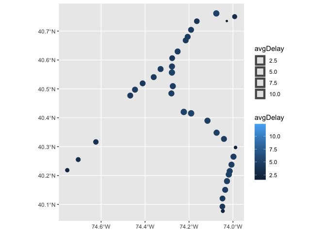
Plotting average station delay at each station allows us to visualize more concretely how delays are playing out on a larger scale.
# njgin.line <- st_read("https://opendata.arcgis.com/datasets/e6701817be974795aecc7f7a8cc42f79_0.geojson")
# njgin.station <- st_read("https://opendata.arcgis.com/datasets/4809dada94c542e0beff00600ee930f6_0.geojson")
njtlines %>% left_join(dplyr::select(njt_sf$stops,stop_id,zone_id,geometry),by=c("to_id"="stop_id")) %>%
  st_as_sf() %>% filter(isWkdy) %>% group_by(to) %>%
  summarise(avgDelay=mean(delay_minutes)) %>%
  ggplot() + geom_sf(aes(color=avgDelay,size=avgDelay))
Regression model building and training
We introduce the time lag into our predictor set, with several intervals: 30 minutes, 1/1.5/2/3/12 hours, and one day. The correlation coefficients show that the lags up to 3 hours have reasonably high correlation.
njtlines <- njtlines %>% ungroup() %>%
  arrange(from,interval30) %>%
  mutate(lag30Min = dplyr::lag(delay_minutes,1),
         lag1Hour = dplyr::lag(delay_minutes,2),
         lag90Min = dplyr::lag(delay_minutes,3),
         lag2Hour = dplyr::lag(delay_minutes,4),
         lag3Hour = dplyr::lag(delay_minutes,6),
         lag12Hour = dplyr::lag(delay_minutes,24),
         lag1Day = dplyr::lag(delay_minutes,48)
  )
as.data.frame(njtlines) %>%
    group_by(interval30) %>%
    summarise_at(vars(starts_with("lag"), "delay_minutes"), mean, na.rm = TRUE) %>%
    gather(Variable, Value, -interval30, -delay_minutes) %>%
    mutate(Variable = factor(Variable, levels=c("lag30Min","lag1Hour","lag90Min","lag2Hour",
                                                "lag3Hour","lag12Hour","lag1Day")))%>%
    group_by(Variable) %>%
    summarize(correlation = round(cor(Value, delay_minutes),2))
## # A tibble: 8 × 2
##   Variable  correlation
##   <fct>           <dbl>
## 1 lag30Min         0.68
## 2 lag1Hour         0.55
## 3 lag90Min         0.51
## 4 lag2Hour         0.44
## 5 lag3Hour         0.31
## 6 lag12Hour        0.17
## 7 lag1Day          0.09
## 8 <NA>             0.94
Correlation matrix
Compiling the correlation matrix shows the relationship between all predictors to the response variable, delay_minutes, and each other.
njtlines %>% select_if(is.numeric) %>%
  cor() %>% ggcorrplot(type="lower", method="circle") +
  scale_size_continuous(range=c(1,8),) +
  labs(title = "Correlation matrix",
       subtitle = "Across numeric variables")

Model building
We begin model training by log-transforming the delay time, in order to compensate for the natural left skew of delays (many small, few large). Then create a training and testing dataset by splitting the dataset to before and after August.
njtlines <- njtlines %>% mutate(logDelay = log(delay_minutes + 0.1))

delay.Train <- filter(njtlines, date < ymd(20190801))
delay.Test <- filter(njtlines, date >= ymd(20190801))
Our model uses a total of nineteen predictors, after repeated evaluation of predictor strength: - Categorical: line, to(station), time period, direction, - Numeric: Wind speed, total cancelled trains, trains cancelled for Amtrak, crew availability, equipment availability, mechanical issues, inter-station distance, delay lag by previous station, time lags 30 min/1/1.5/2/3/12 hours - Binary: is Weekday train
fit <- lm(logDelay ~ line + to + period + isWkdy + direction + Wind_Speed +
            CANCEL_TOTAL + AMTRAK + crewAvail +
            equipAvail + Mechanical + inter.dist.mp + lagStation +
            lag30Min + lag1Hour + lag90Min + lag2Hour + lag3Hour + lag12Hour,
          data=delay.Train)

f <- predict(fit, delay.Test)
Test <- bind_cols(delay.Test, as_tibble(f)) %>%
          rename(Delay.Predict = value) %>%
          mutate(Delay.Error = Delay.Predict - delay_minutes,
               Delay.AbsError = abs(Delay.Predict - delay_minutes),
               Delay.APE = (abs(Delay.Predict - delay_minutes)) / Delay.Predict)
mae <- mean(Test$Delay.AbsError, na.rm=TRUE)
mape <- mean(Test$Delay.APE, na.rm=TRUE)
stargazer::stargazer(fit, type='html', align=TRUE, no.space=TRUE)
| Dependent variable: | |
| logDelay | |
| lineNo Jersey Coast | 1.328\*\*\* |
| (0.032) | |
| lineNortheast Corrdr | 1.433\*\*\* |
| (0.033) | |
| toAbsecon | -0.388\*\*\* |
| (0.042) | |
| toAllenhurst | 0.195\*\*\* |
| (0.021) | |
| toAsbury Park | 0.082\*\*\* |
| (0.021) | |
| toAtco | -0.578\*\*\* |
| (0.042) | |
| toAtlantic City Rail Terminal | 0.185\*\*\* |
| (0.042) | |
| toAvenel | -0.188\*\*\* |
| (0.026) | |
| toBay Head | -1.184\*\*\* |
| (0.021) | |
| toBelmar | 0.196\*\*\* |
| (0.021) | |
| toBradley Beach | 0.191\*\*\* |
| (0.021) | |
| toCherry Hill | -0.482\*\*\* |
| (0.042) | |
| toEdison | -0.235\*\*\* |
| (0.016) | |
| toEgg Harbor City | -0.348\*\*\* |
| (0.042) | |
| toElberon | 0.462\*\*\* |
| (0.021) | |
| toElizabeth | -0.047\*\*\* |
| (0.015) | |
| toHamilton | -1.251\*\*\* |
| (0.016) | |
| toHammonton | -0.514\*\*\* |
| (0.042) | |
| toHazlet | -0.045\*\*\* |
| (0.017) | |
| toHoboken | -1.410\*\*\* |
| (0.050) | |
| toJersey Avenue | -0.634\*\*\* |
| (0.019) | |
| toLinden | 0.091\*\*\* |
| (0.015) | |
| toLindenwold | -0.395\*\*\* |
| (0.042) | |
| toLittle Silver | -0.190\*\*\* |
| (0.017) | |
| toLong Branch | -1.855\*\*\* |
| (0.016) | |
| toManasquan | 0.099\*\*\* |
| (0.021) | |
| toMetropark | -0.046\*\*\* |
| (0.016) | |
| toMetuchen | -0.355\*\*\* |
| (0.016) | |
| toMiddletown NJ | -0.092\*\*\* |
| (0.017) | |
| toNew Brunswick | -0.131\*\*\* |
| (0.016) | |
| toNew York Penn Station | -1.754\*\*\* |
| (0.014) | |
| toNewark Airport | 0.030\*\* |
| (0.015) | |
| toNewark Penn Station | -0.162\*\*\* |
| (0.014) | |
| toNorth Elizabeth | -0.070\*\*\* |
| (0.018) | |
| toPennsauken | -0.526\*\*\* |
| (0.042) | |
| toPerth Amboy | 0.073\*\*\* |
| (0.017) | |
| toPhiladelphia | |
| toPoint Pleasant Beach | -0.126\*\*\* |
| (0.021) | |
| toPrinceton Junction | -0.375\*\*\* |
| (0.017) | |
| toRahway | -0.583\*\*\* |
| (0.015) | |
| toRed Bank | -0.117\*\*\* |
| (0.017) | |
| toSecaucus Upper Lvl | 0.146\*\*\* |
| (0.014) | |
| toSouth Amboy | -0.108\*\*\* |
| (0.016) | |
| toSpring Lake | 0.201\*\*\* |
| (0.021) | |
| toTrenton | -1.153\*\*\* |
| (0.016) | |
| toWoodbridge | 0.054\*\*\* |
| (0.016) | |
| periodEvening | -0.062\*\*\* |
| (0.005) | |
| periodMidday | -0.066\*\*\* |
| (0.005) | |
| periodOvernight | -0.349\*\*\* |
| (0.007) | |
| periodPM peak | -0.092\*\*\* |
| (0.005) | |
| isWkdy | -0.030\*\*\* |
| (0.004) | |
| directionwestbound | 0.228\*\*\* |
| (0.004) | |
| Wind\_Speed | 0.0003 |
| (0.0003) | |
| CANCEL\_TOTAL | -0.0002 |
| (0.0001) | |
| AMTRAK | -0.002\*\*\* |
| (0.0004) | |
| crewAvail | 0.001\*\*\* |
| (0.0001) | |
| equipAvail | 0.002\*\*\* |
| (0.0002) | |
| Mechanical | 0.004\*\*\* |
| (0.0004) | |
| inter.dist.mp | -0.023\*\*\* |
| (0.001) | |
| lagStation | 0.115\*\*\* |
| (0.0003) | |
| lag30Min | -0.002\*\*\* |
| (0.0003) | |
| lag1Hour | 0.002\*\*\* |
| (0.0003) | |
| lag90Min | 0.002\*\*\* |
| (0.0003) | |
| lag2Hour | 0.002\*\*\* |
| (0.0003) | |
| lag3Hour | 0.003\*\*\* |
| (0.0002) | |
| lag12Hour | 0.003\*\*\* |
| (0.0002) | |
| Constant | -0.866\*\*\* |
| (0.031) | |
| Observations | 490,078 |
| R2 | 0.448 |
| Adjusted R2 | 0.447 |
| Residual Std. Error | 1.206 (df = 490012) |
| F Statistic | 6,106.507\*\*\* (df = 65; 490012) |
| Note: | *p<0.1; **p<0.05; ***p<0.01 |
Based on the test data alone, we can evaluate the initial quality of the linear model through goodness of fit metrics. When trying to predict the delay for each station arrival data point on the exact same test data, the interval between what is predicted through the model and what was actually observed is the error; averaged we can find the Mean Absolute Error (MAE). In addition, the Mean Absolute Percent Error (MAPE) finds what percentage of trains were predicted incorrectly. was found to be 4.7654854 minutes, and the MAPE was 4.0853282.
Predictions on test data
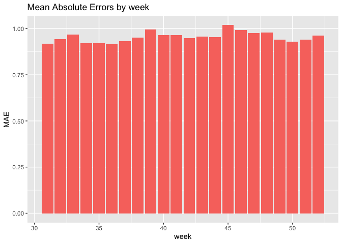
Our model results are promising, with the best predictive power being the model including the time lags. The mean absolute error for the test set by week is around 0.9 minutes, but cross-validated by hour of week, the distribution peaks at 0.1 minutes.
delay.Test.weekNest <-
  delay.Test %>%
  nest(-week)
model_pred <- function(dat, fit){
   pred <- predict(fit, newdata = dat)}
week_predictions <-
  delay.Test.weekNest %>%
    mutate(model = map(.x = data, fit = fit, .f = model_pred)) %>%
    gather(Regression, Prediction, -data, -week) %>%
    mutate(Observed = map(data, pull, logDelay),
           Absolute_Error = map2(Observed, Prediction, ~ abs(.x - .y)),
           MAE = map_dbl(Absolute_Error, mean, na.rm = TRUE),
           sd_AE = map_dbl(Absolute_Error, sd, na.rm = TRUE))
week_predictions %>%
  dplyr::select(week, Regression, MAE) %>%
  gather(Variable, MAE, -Regression, -week) %>%
  ggplot(aes(week, MAE)) +
    geom_bar(aes(fill = Regression), position = "dodge", stat="identity") +
    labs(title = "Mean Absolute Errors by week") + theme(legend.position='none')
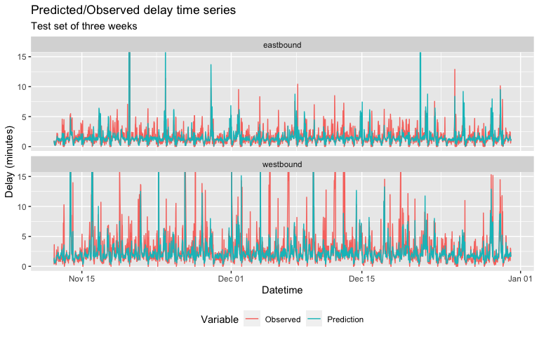
When we plot the predicted average delay against the observed delay, we notice that while “regular” periodic small delays of 4 minutes of less are well-predicted against, large delays of 7 minutes or more are more intermittently anticipated and predicted.
week_predictions %>%
    mutate(interval30 = map(data, pull, interval30),
           from = map(data, pull, from),
           direction = map(data,pull,direction)) %>%
    dplyr::select(interval30, from, direction, Observed, Prediction, Regression) %>%
    unnest(cols = c(interval30, from, direction, Observed, Prediction)) %>%
    gather(Variable, Value, -Regression, -interval30, -from, -direction) %>%
    group_by(Regression, Variable, interval30, direction) %>%
    summarize(Value = mean(Value)) %>%
    filter(week(interval30) > 45) %>%
    ggplot(aes(interval30, exp(Value)-0.1, colour=Variable)) +
      geom_line(size = 0.5) +
      facet_wrap(~direction, ncol=1) +
      labs(title = "Predicted/Observed delay time series",
           subtitle = "Test set of three weeks",  x = "Datetime", y= "Delay (minutes)") +
    theme(legend.position='bottom') +
    coord_cartesian(ylim=c(0,15))
Cross-validation
In linear models, is is always important to repeat predictions on test data on multiple dimensions, known as cross-validation. If the initial accuracy found above holds for these additional dimensions, then we can say the model has a high degree of generalizblity and is not badly overfit onto this specific instance of training data. Incorporating cross-validation across space and time will help us understand where and how our predictions are holding up.
Cross-validation by time
When cross-validated by time, we can see the the MAE is significantly minimized to near-zero; however there are a few large spikes that persist

Cross-validation by space (station)
For CV by station, we see notable spikes in errors at terminal stations, where trains start their run later than scheduled, as well as at the mid-points of lines like the North Jersey Coast Line that continues outward. These can be chalked up to more particular operational quirks that currently do not have any relevant open-facing data attached to them.

Conclusion
On a macro level, our model appears to work with relative accuracy of 4.0853282 percent. This would indicate a fairly successful proof-of concept on paper for including delay predictions as a feature on customer-facing NJ Transit applications. That there was indeed a relatively periodic cycle of baseline delays found is already a significant insight that should be disseminated far and wide. We recommend that NJ Transit begin to incorporate this model both into customer-facing apps and websites, and also into internal dashboards. Most significantly, because of the great ease in capturing delay data, this model can also theoretically be updated on a relatively frequent basis as well. Schedule planners can then begin to adjust schedules to anticipate delays more frequently, right-of-way personnel can start to notice physical plant factors that cause delays sooner, and overall NJ Transit’s commuter rail network can be more robust to delays.
However, at this stage we are beginning to see the limits of solely relying on public-facing data, especially in the context of a relatively closed system such as transit. As a system, transit has fewer external socioeconomic factors that are frequently and abundantly captured in open data; on the contrary, most data are captive to the department or division that directly captured it for internal purposes only. Nominally, there is indeed little reason why any given person would want data on known trackage bottlenecks, rolling stock performance figures, dispatch accuracy (particularly important for start of runs!) trip-level passenger boarding data, and thousands of other possible data points. We can point out certain factors relatively easily, whether because of bottlenecks on physical trackage; but not being able to to predict Amtrak dispatchers that actually control the traffic, and other incidents like mechanical issues, passenger-related delays. Thus, working directly with NJ Transit Operations and Maintenance personnel and sharing this previously isolated data may help us to understand delays on a more sophisticated level.
In addition, there is still the distinct possibility that any seemingly random or spontaneous factor could affect delays at any time, too rapid or too abstract to quantify for use in this model. June 2019’s labor disruptions was an example, as is the continuing pandemic and the effects it has on overall ridership, particularly on known bottlenecks such as boarding at terminal stations. Very likely, delays as a matter of pure passenger operations will continue to minimize at peak hours, and perhaps persist in off-peak hours if customers shift towards riding off-peak. The pandemic has not only shifted ridership, but fundamentally how NJ Transit’s workforce and operations might perhaps be operated on a daily basis, and this needs to be anticipated as well.
Future steps to be taken with this model abound. As said, the pandemic makes all pre-2020 data somewhat outdated in retrospect, and this model will have to be repeated through at least a full year in 2021 if immediate utility is to be prioritized. Secondly, expanding this model across all lines can be possible with more computing power and memory. In addition, delay interactions with other modes should be explored: Amtrak’s presence on the Northeast Corridor alone is a major factor, as trains there are actually all dispatched by Amtrak staff and Amtrak trains are usually prioritized. Integrating the possibilty of bus and light rail connections, both on NJT and neighboring systems, could be interesting to see if intermodal transfers are already being affected through delays on the single system of commuter rail. And lastly, it is of great interest to model scenarios where potential disruptive interventions, such as a new Hudson River Tunnel, could minimize delays to a quantifiable and definitive extent. Knowing exactly how much any given rider’s commute could be improved through investments makes it a powerful tool for advocates and politicians to argue for them, to ensure the continued operating stability and growth of NJ Transit and all transit agencies.